Lithography is a relatively young printmaking technique. Unlike relief printing techniques dating back to the Middle Ages (such as woodcut) and intaglio techniques (e.g. acid-etched etching or drypoint scratched directly into metal), lithography is a planographic printing method. This means a liberation of the work from the indispensable hatchings typical of relief techniques—lines created through the “sculptural” processing of the matrix (in intaglio, ink is forced into the grooves; in relief, it adheres to the raised surface between cuts).
In lithography, the matrix is not a wooden block or a metal plate, but a flat limestone block, on which—after chemical preparation—one draws using greasy crayons, ink, or other substances capable of fattening the stone. Instead of cutting lines with a chisel or needle, one draws directly. Lithography therefore seems to be a technique in which the matrix is completely “transparent”—invisible in the final print. And yet, not entirely. Ink is applied using a roller, and what appears in the final image results from the interaction between the drawn marks and the subtle irregularities of the stone surface.
In the grinding room of a lithography studio, amid the monotonous sound of water and abrasive particles, the slightly scratched surface of the stone becomes a “clean” matrix awaiting the artist’s intervention. The stone is rubbed with another, smaller one; this laborious process determines the appearance of the final prints. Some lithographers polish the stone “to a mirror,” others prefer a rough, sanded texture resembling handmade paper. This grain—called gren—is usually not a semantic element of the image. Like a printing screen, it serves a utilitarian function: it enriches the surface texture of color fields and allows for tonal transitions.
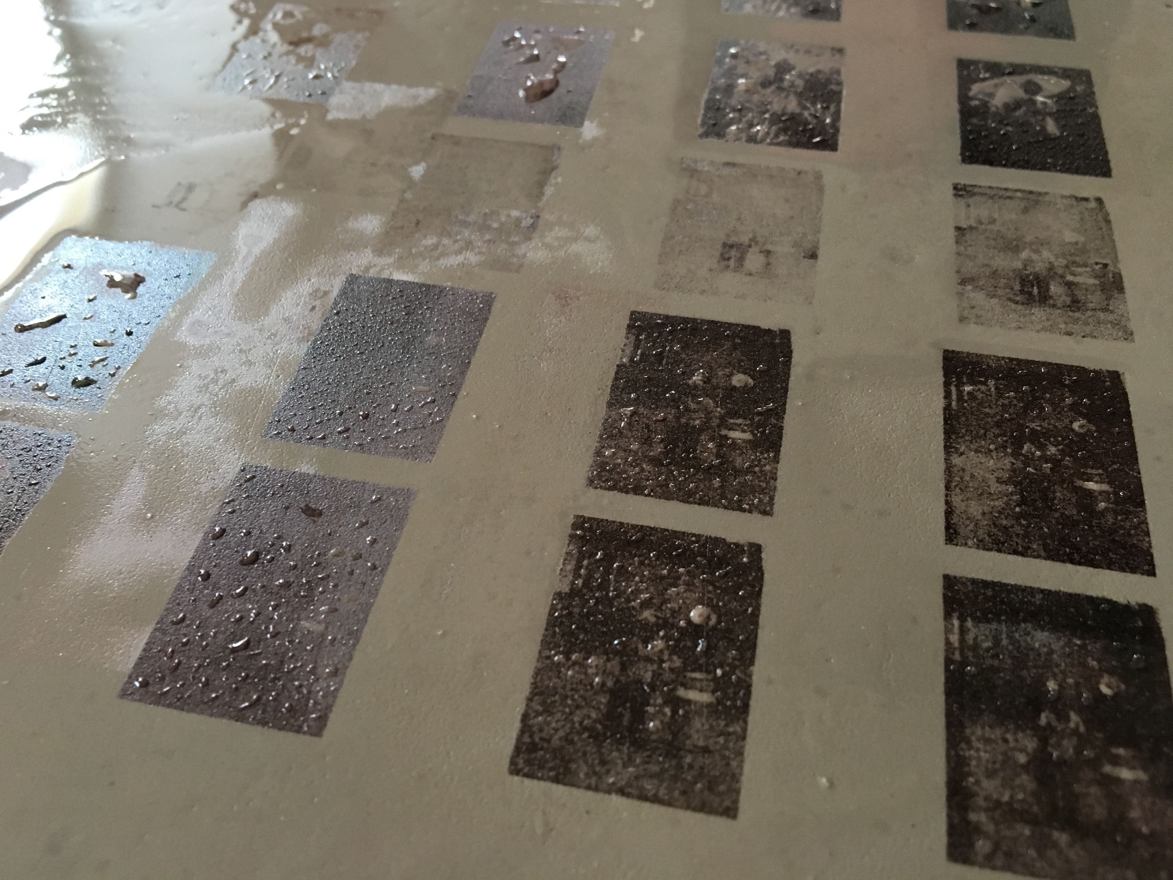
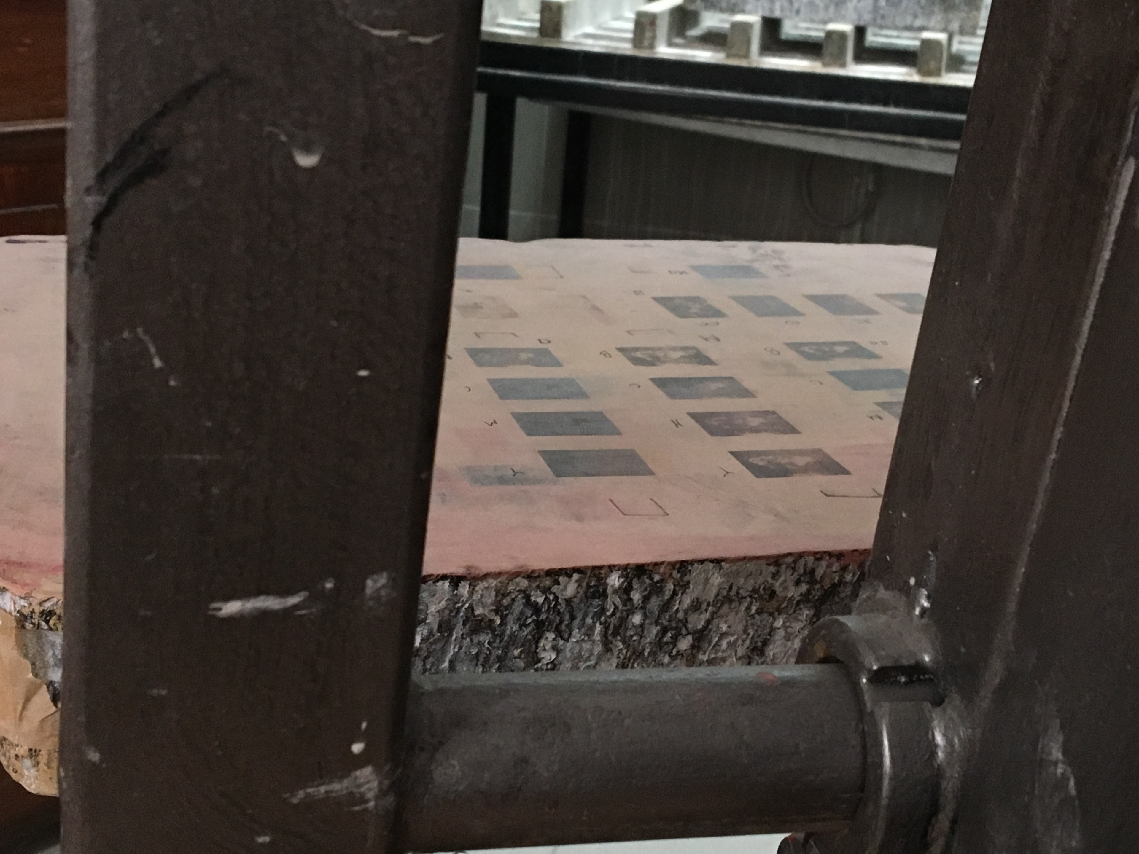
In color lithography, the image is built from multiple matrices. These are prepared either on several stones or on a single one. In the latter case, each new color replaces the previous one—an irreversible process requiring precise planning, as reprinting is impossible without starting over. Each color layer must align perfectly with those already printed. The first impression is only the beginning of a process in which overlapping, transparent layers of color dots create the final image.
While working to align successive layers, one inevitably begins to observe the stone itself—the physical presence of ink, the tiny colored particles adhering to the matrix. One starts to notice how crucial the preparation of the matrix is, and how the “secondary character” of lithography—the stone’s grain—shapes the final result.
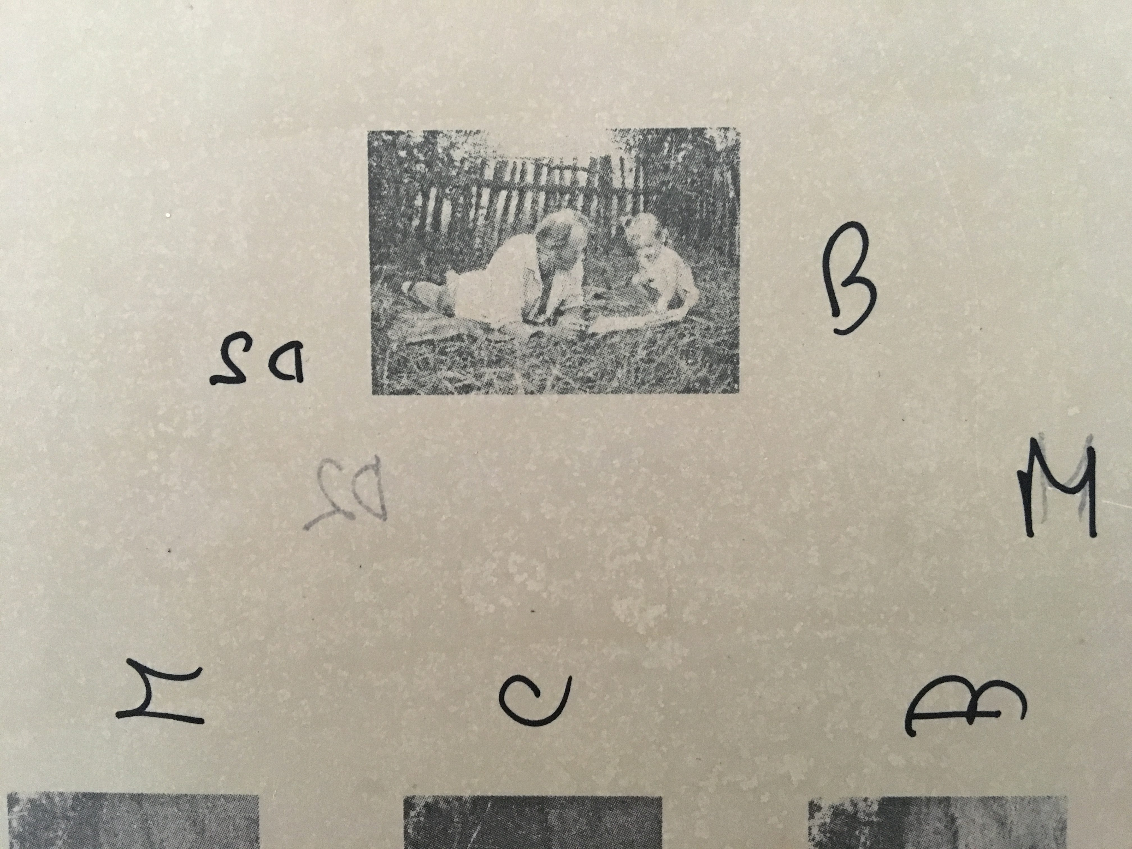
My lithographic explorations have always been connected with photography. Searching through family archives and reanimating figures from old photographs became the basis of my projects. Alongside their personal and existential dimension, formal experimentation with technique has been equally important to me. I began working with black-and-white prints on fabric and spatial forms created by sewing and stuffing printed textiles, often resembling dolls.
Later, I turned to color. Printing on fabric does not allow full control over the printing dot; the ink penetrates the woven structure. Despite this, the interplay of color under light proved fascinating. Eventually, I decided to make light itself an equal partner in my work.
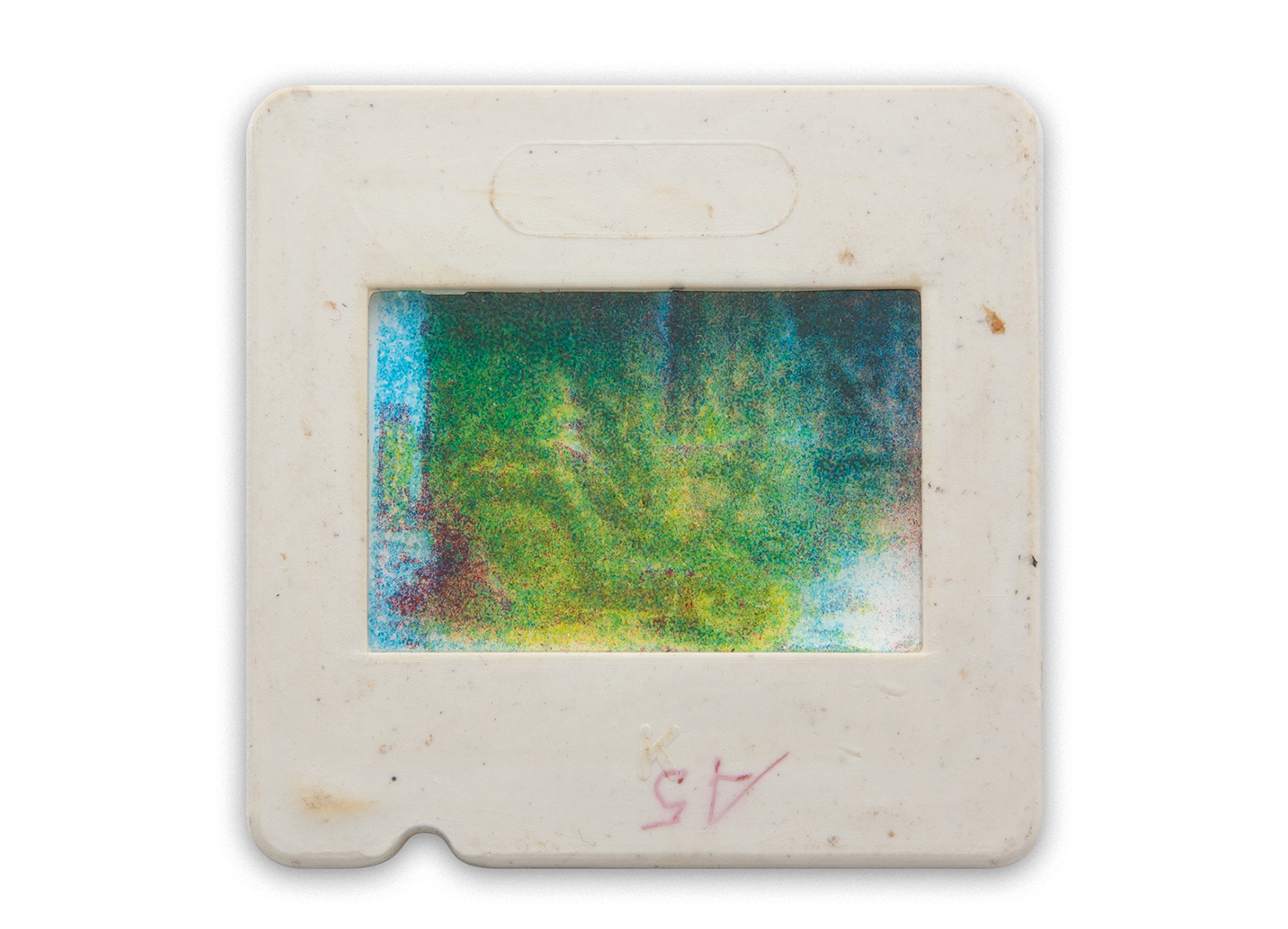
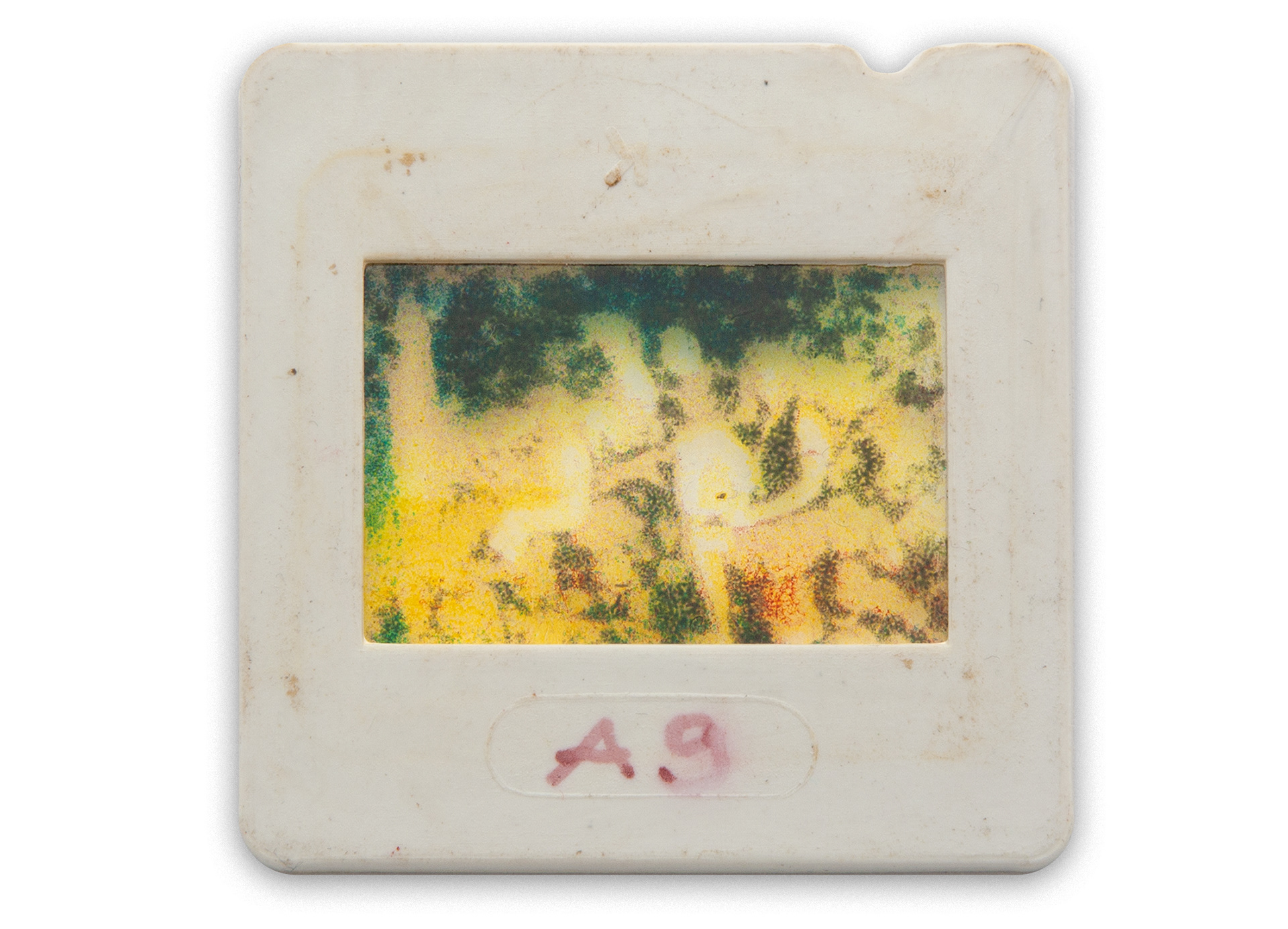
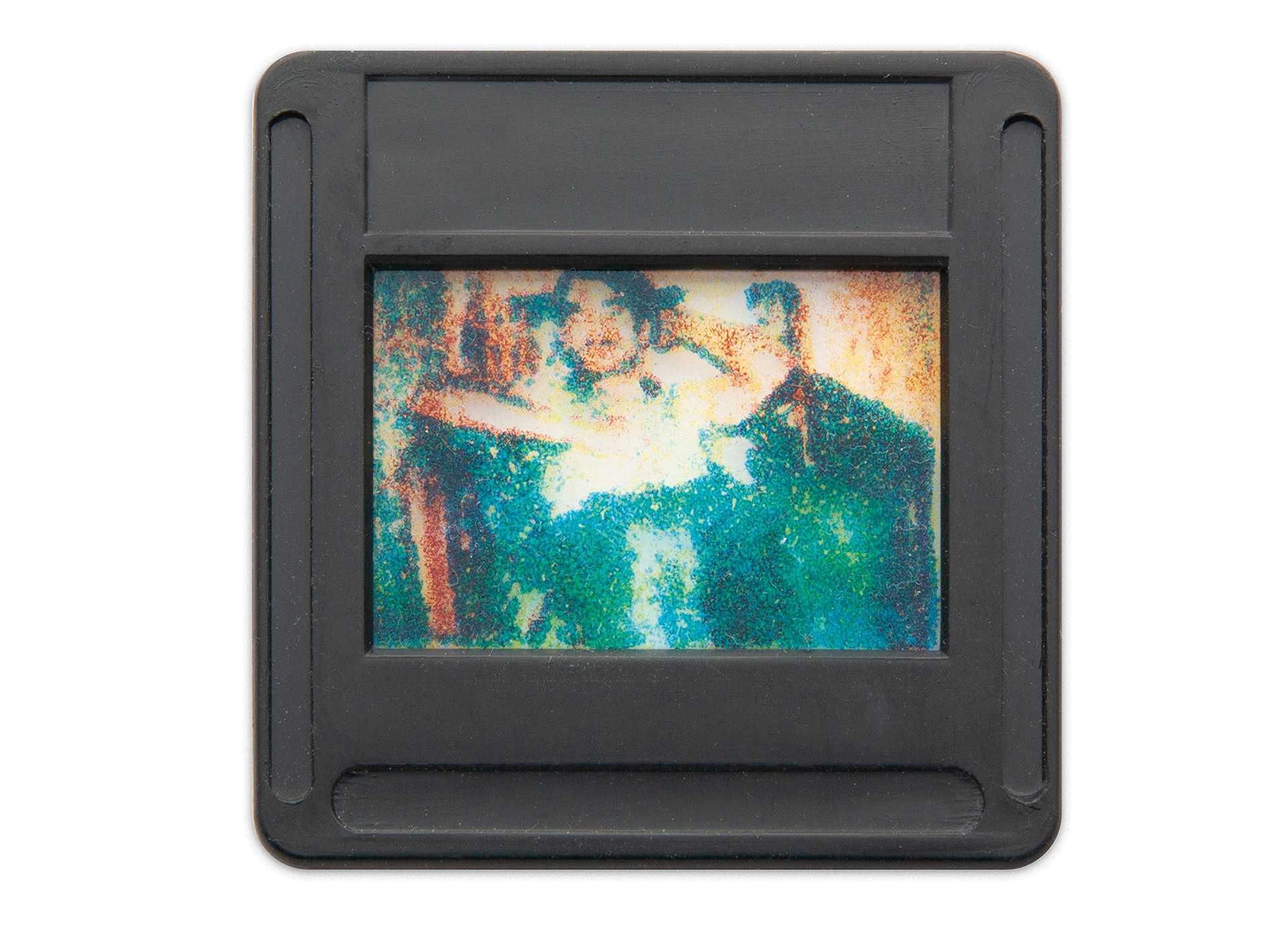
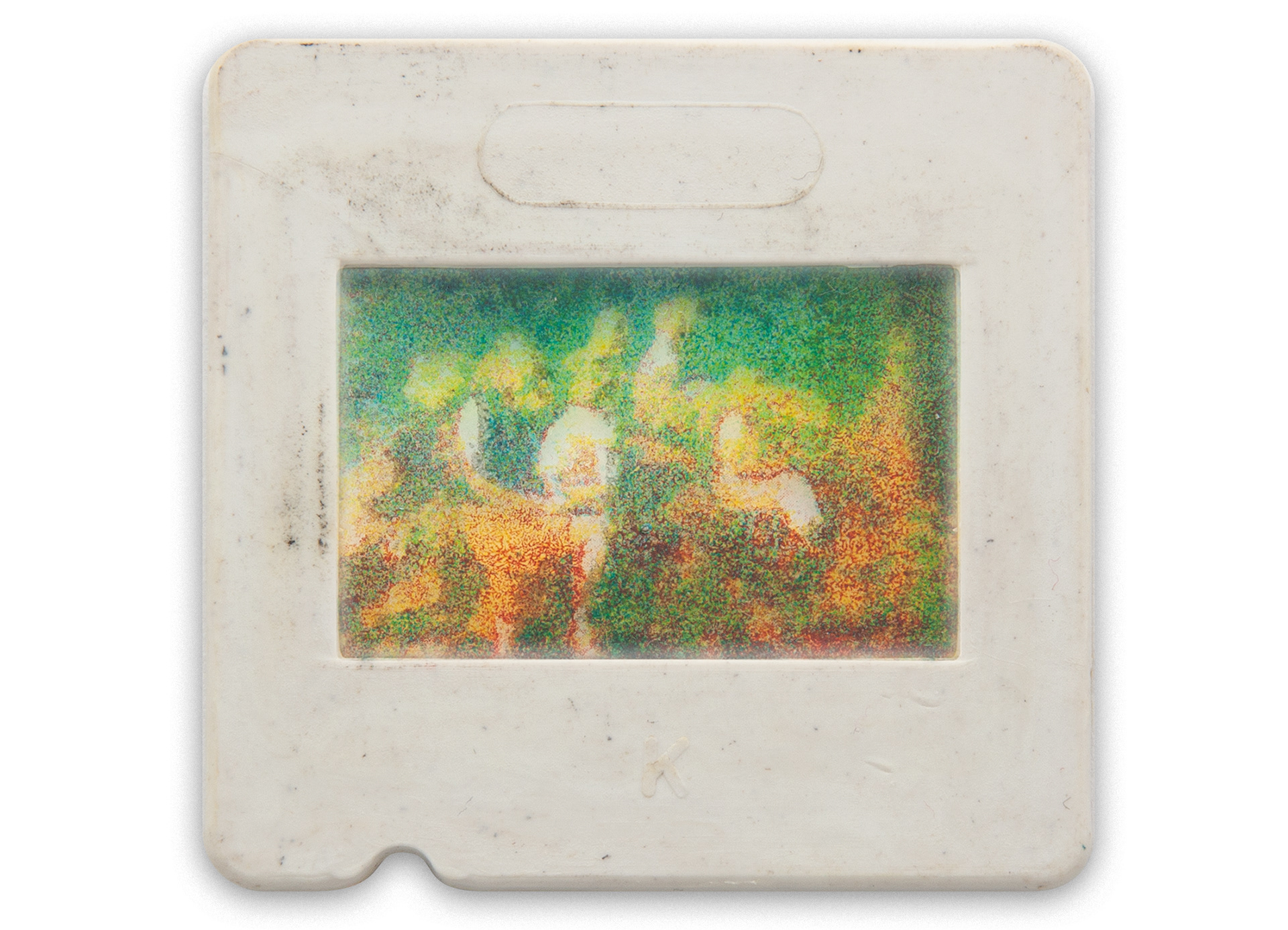
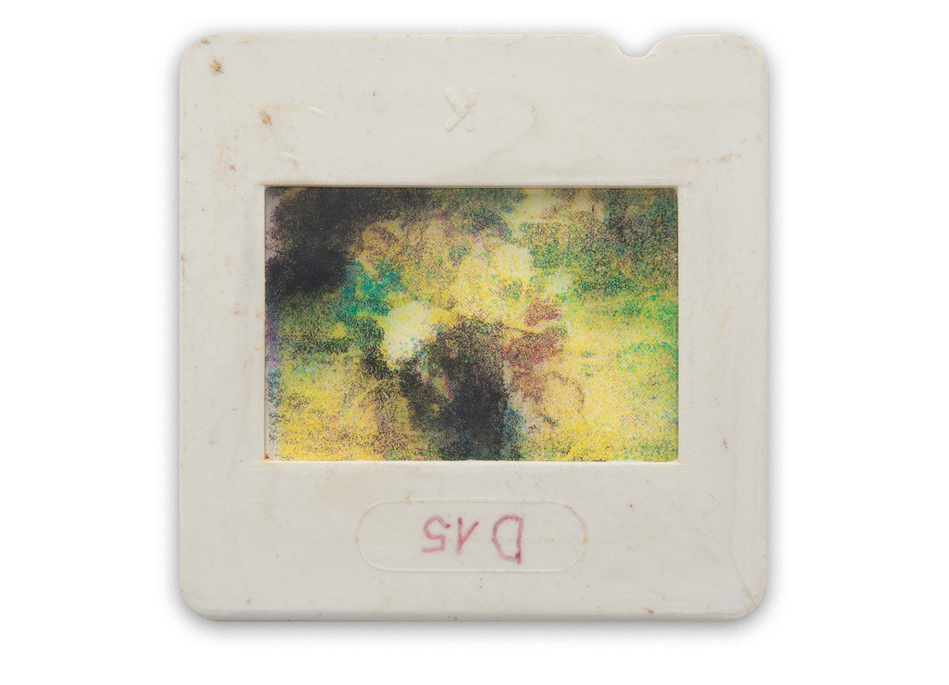
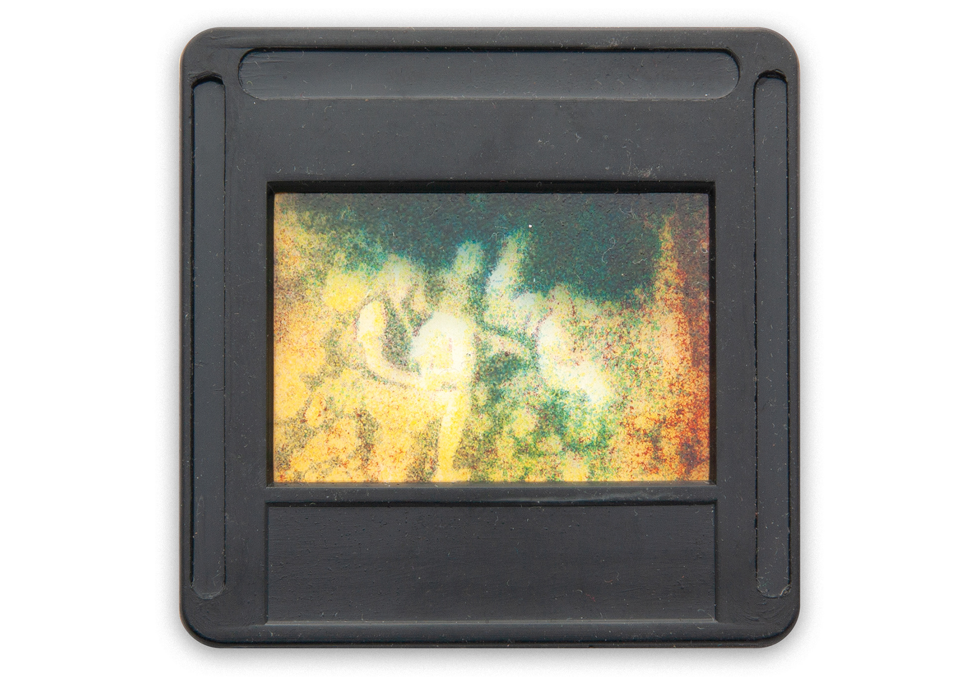
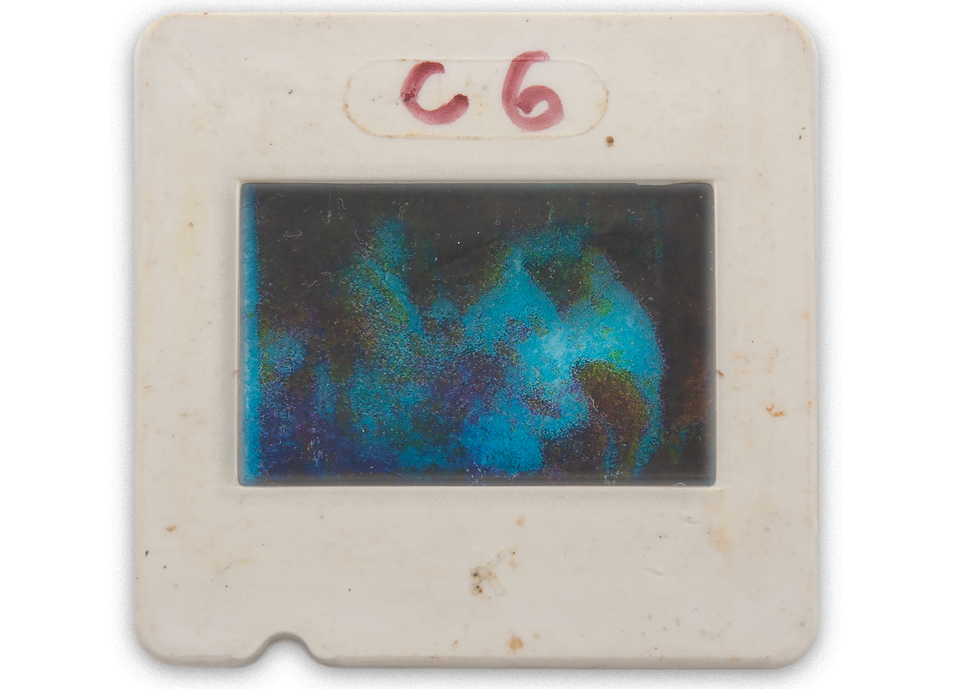
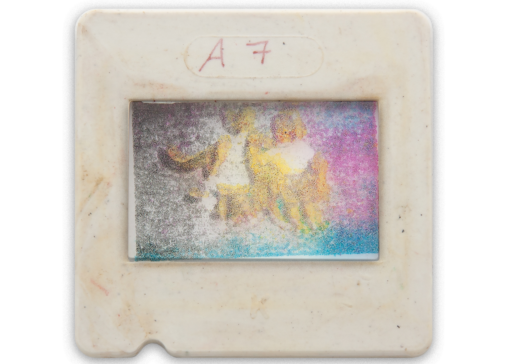
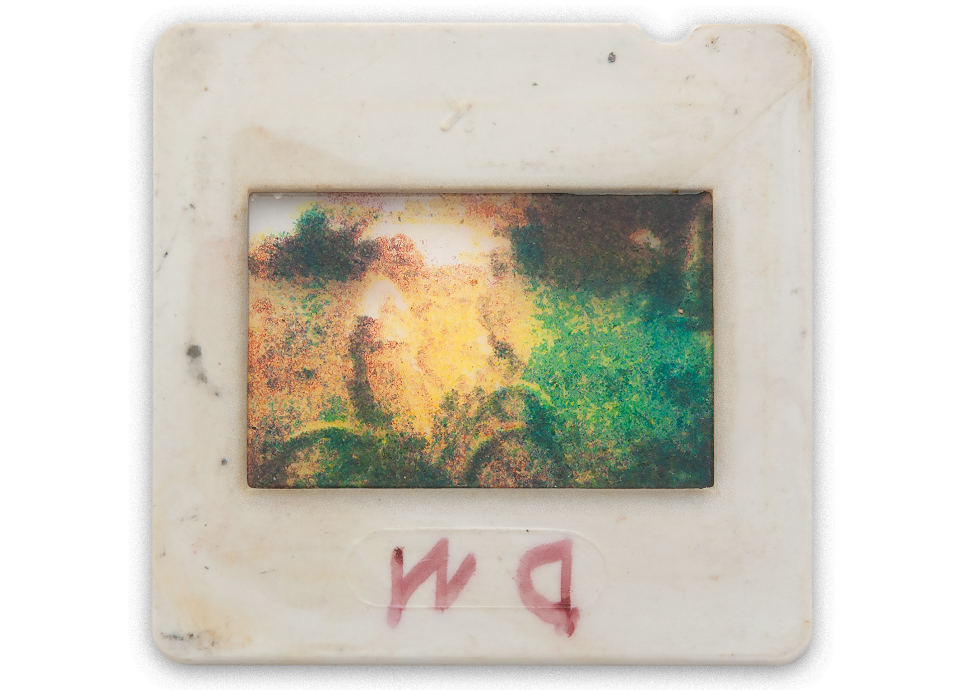
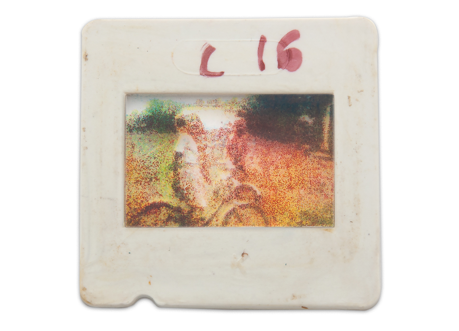
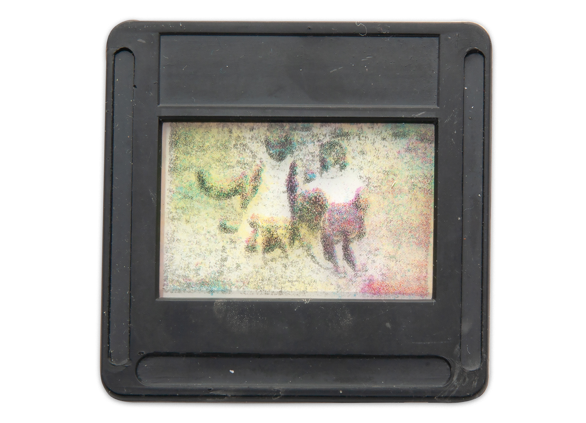
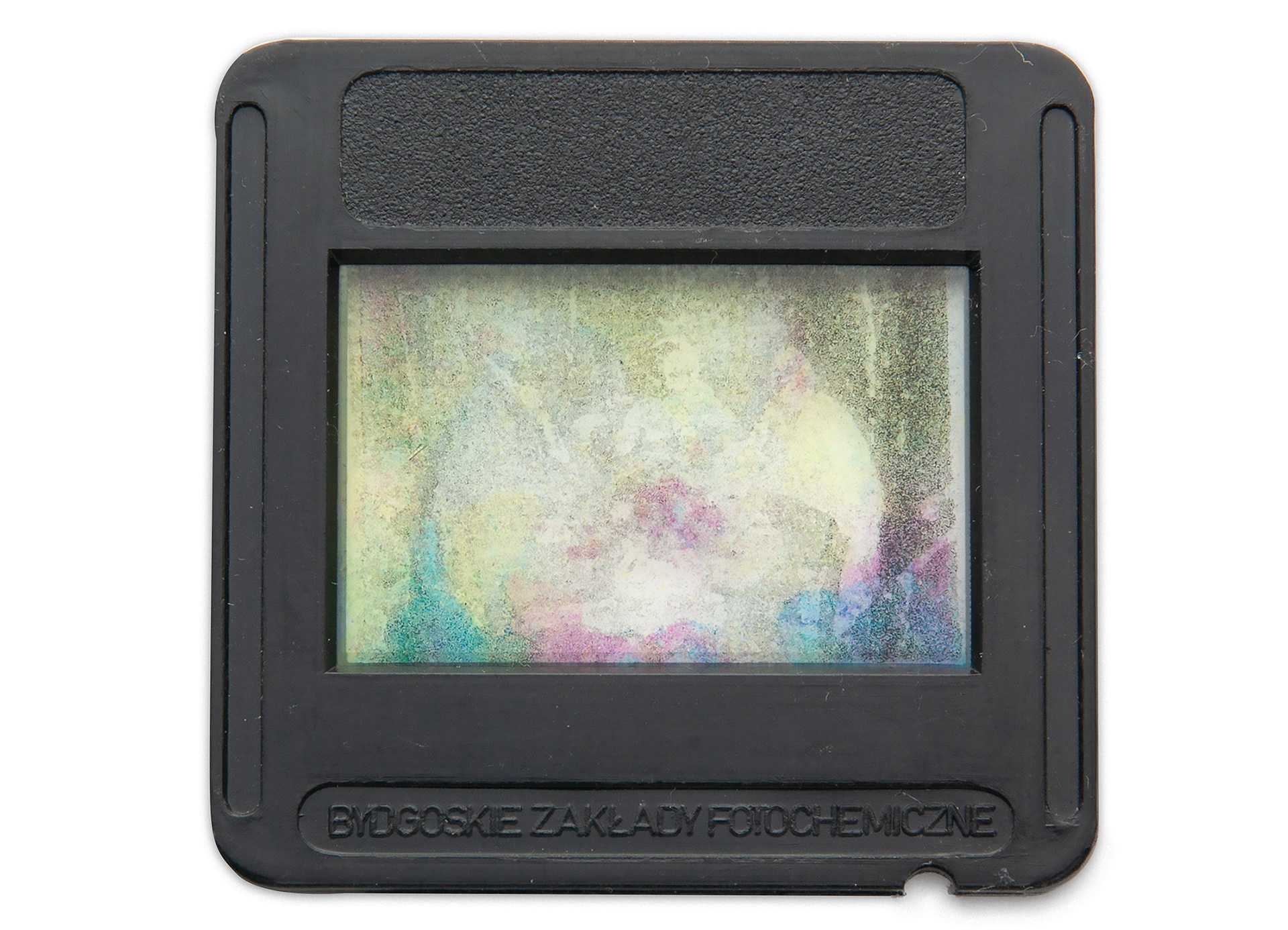
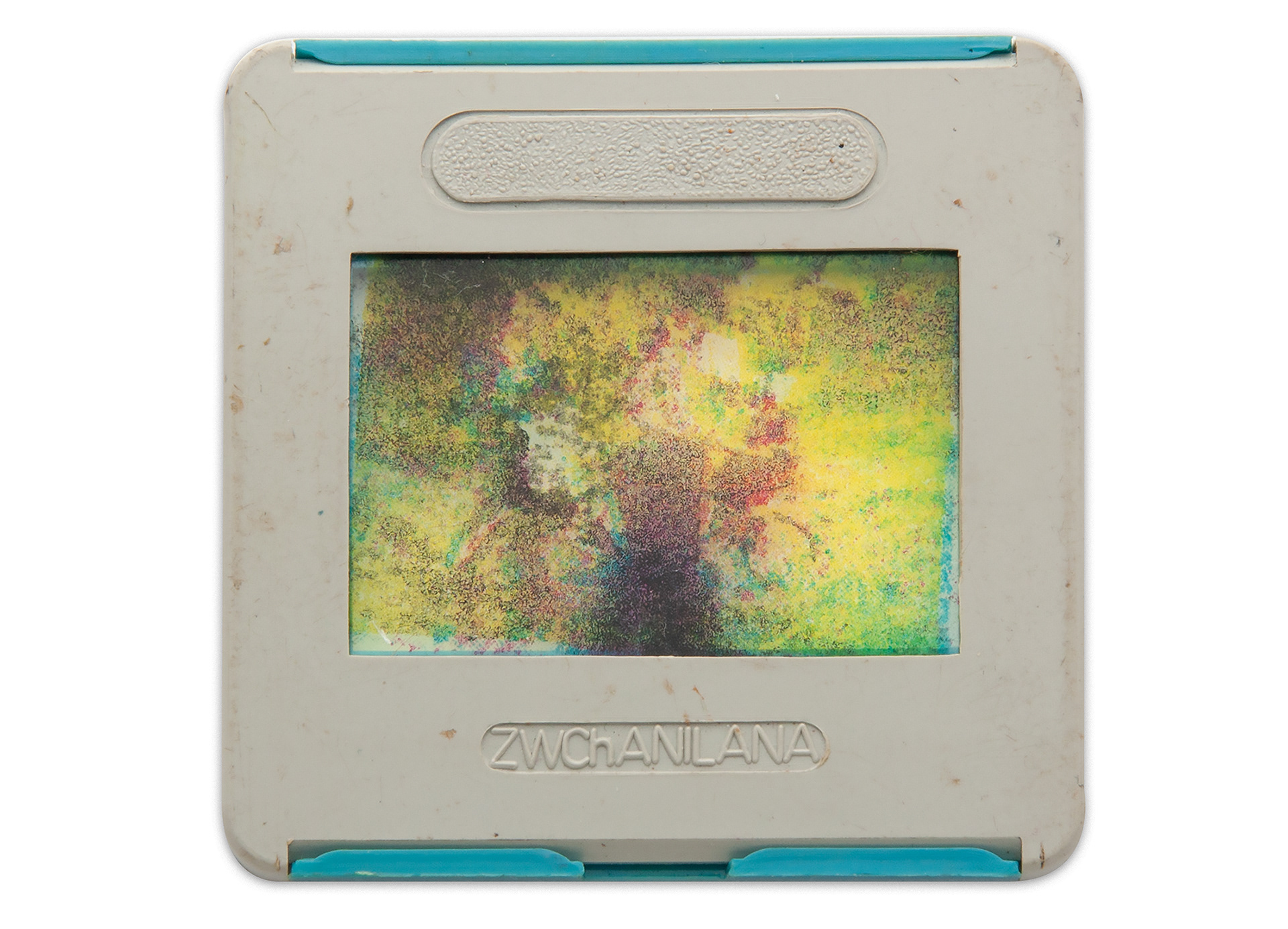
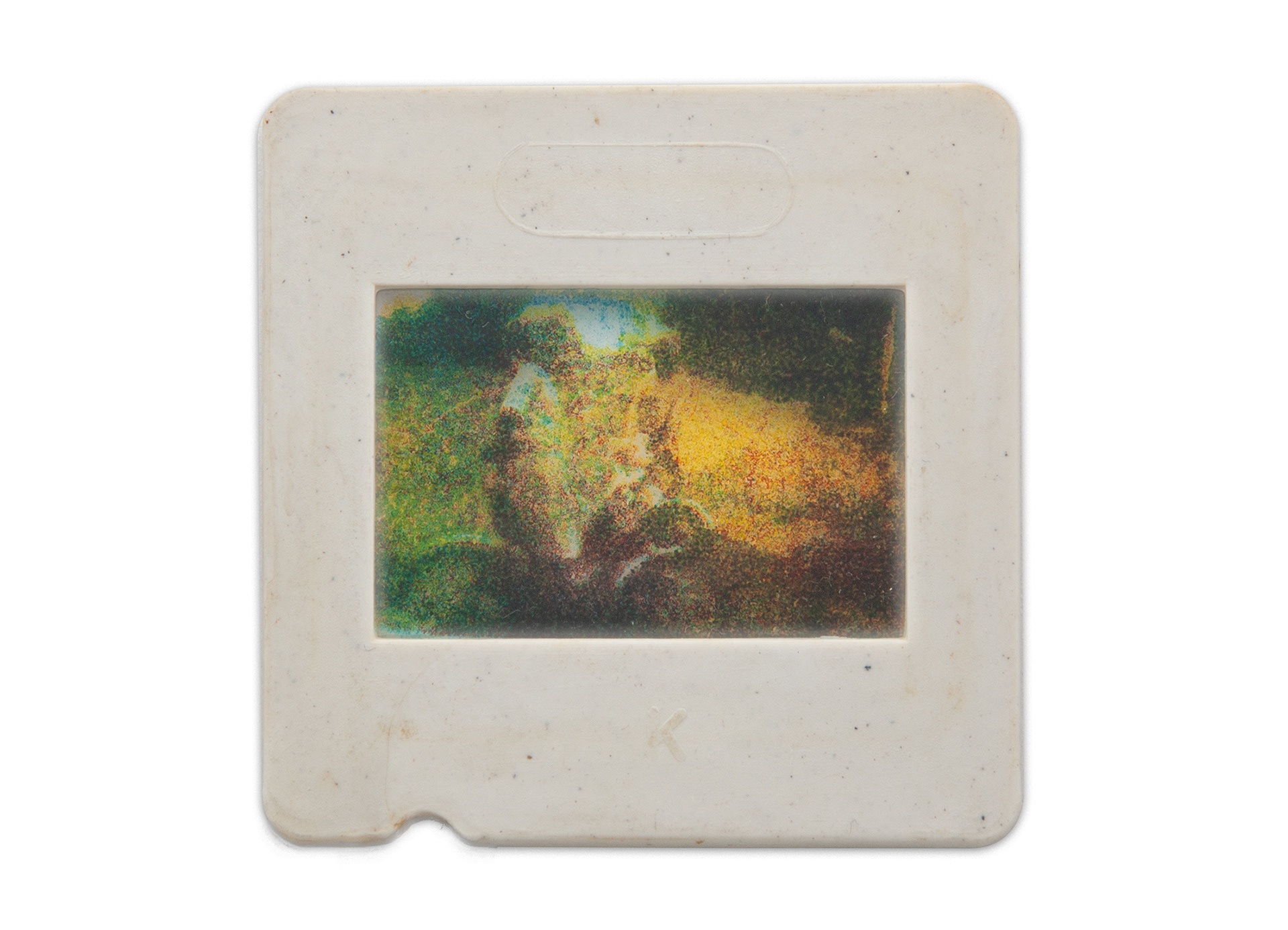
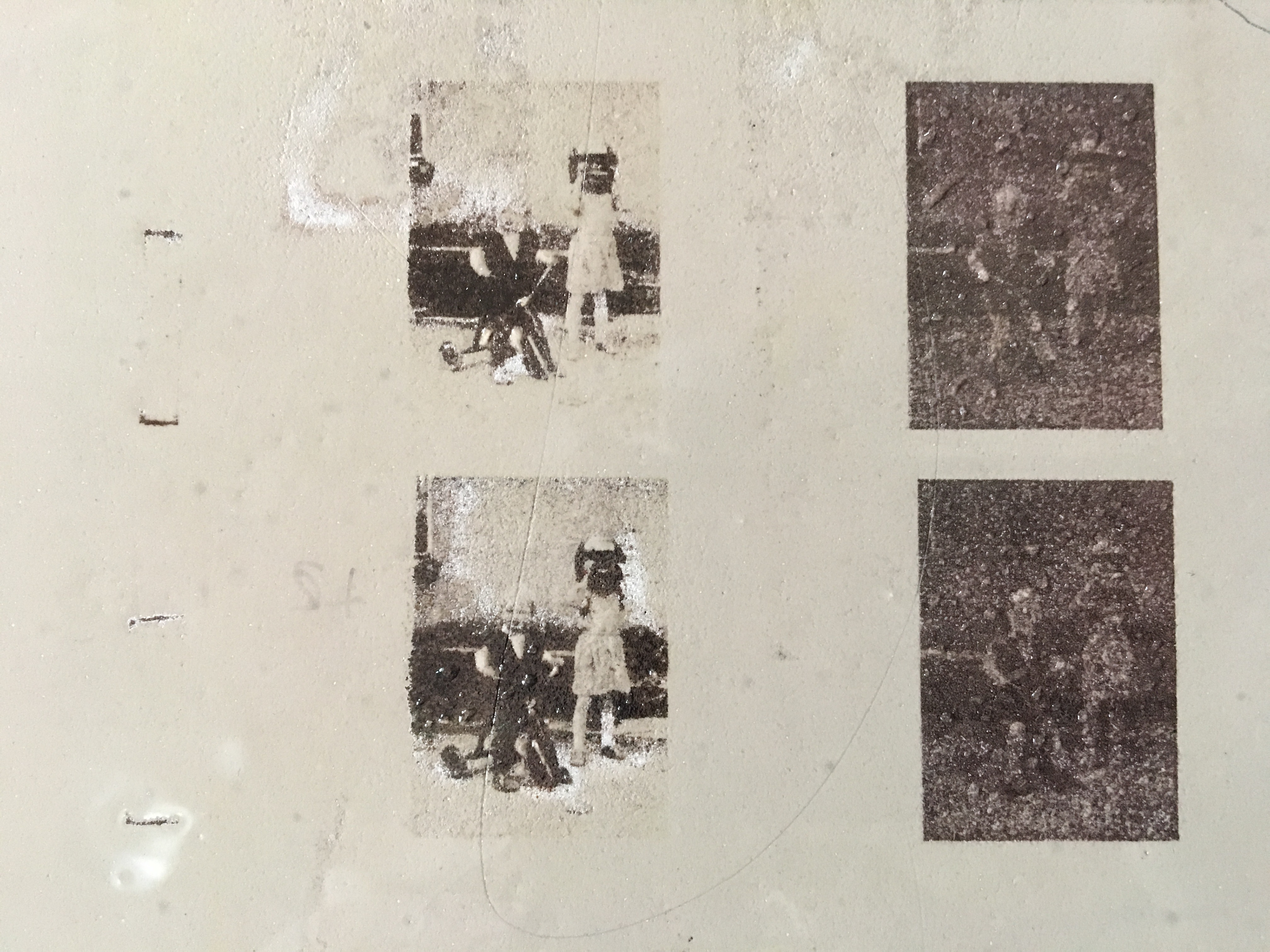
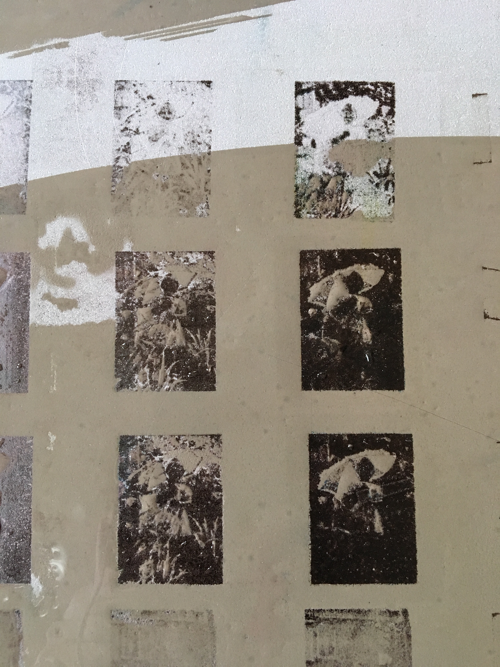
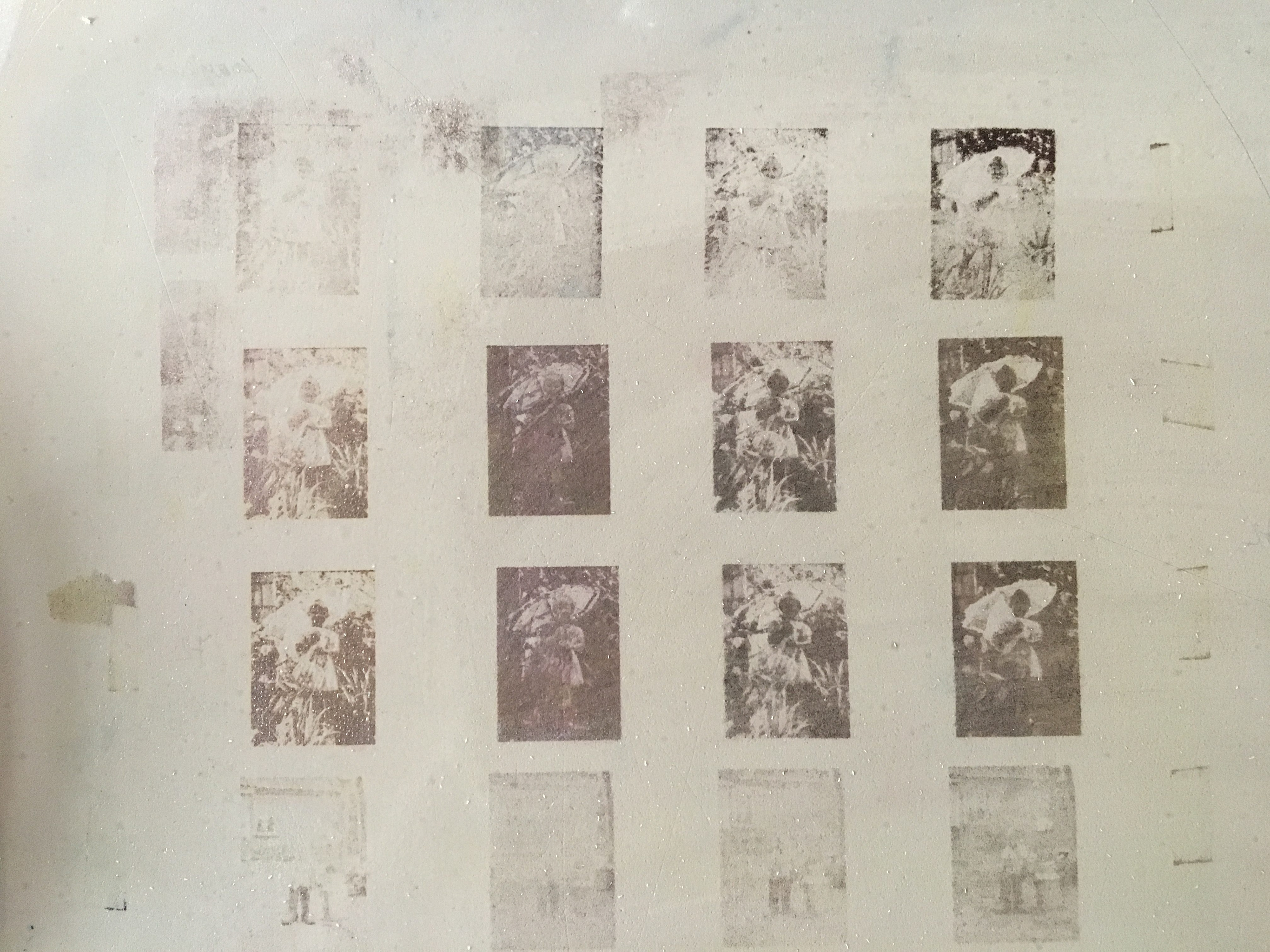
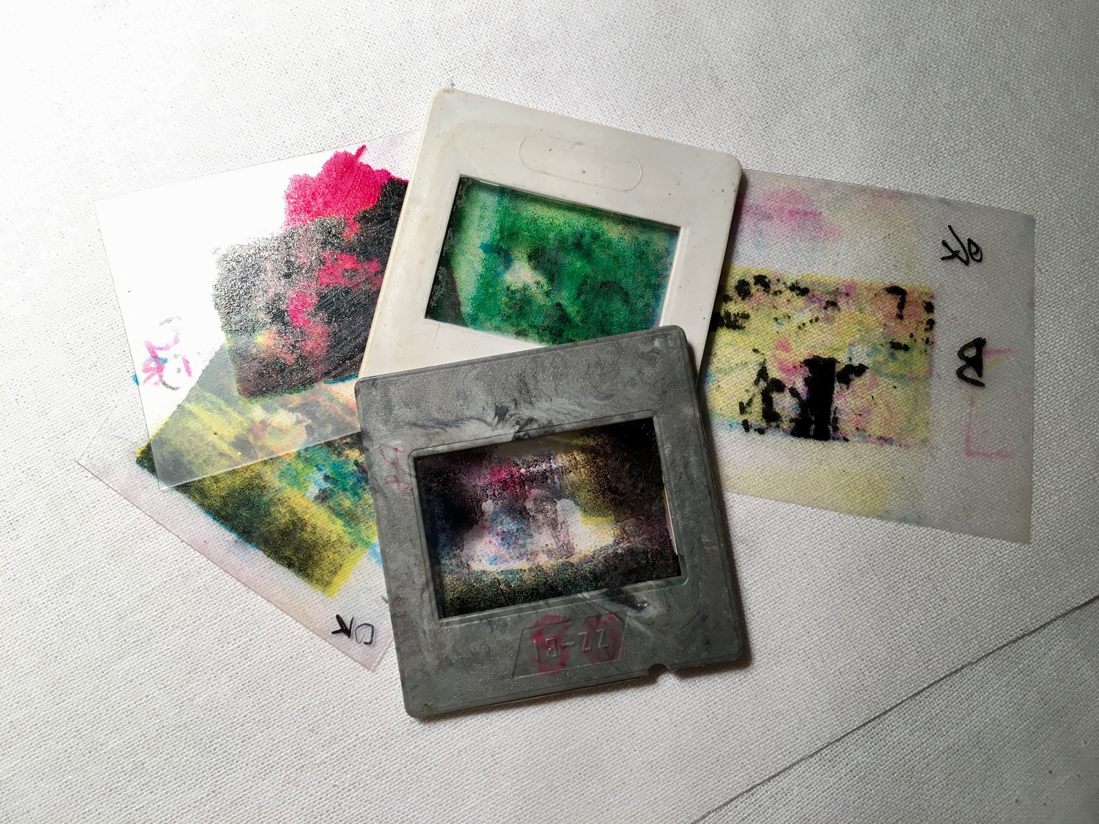
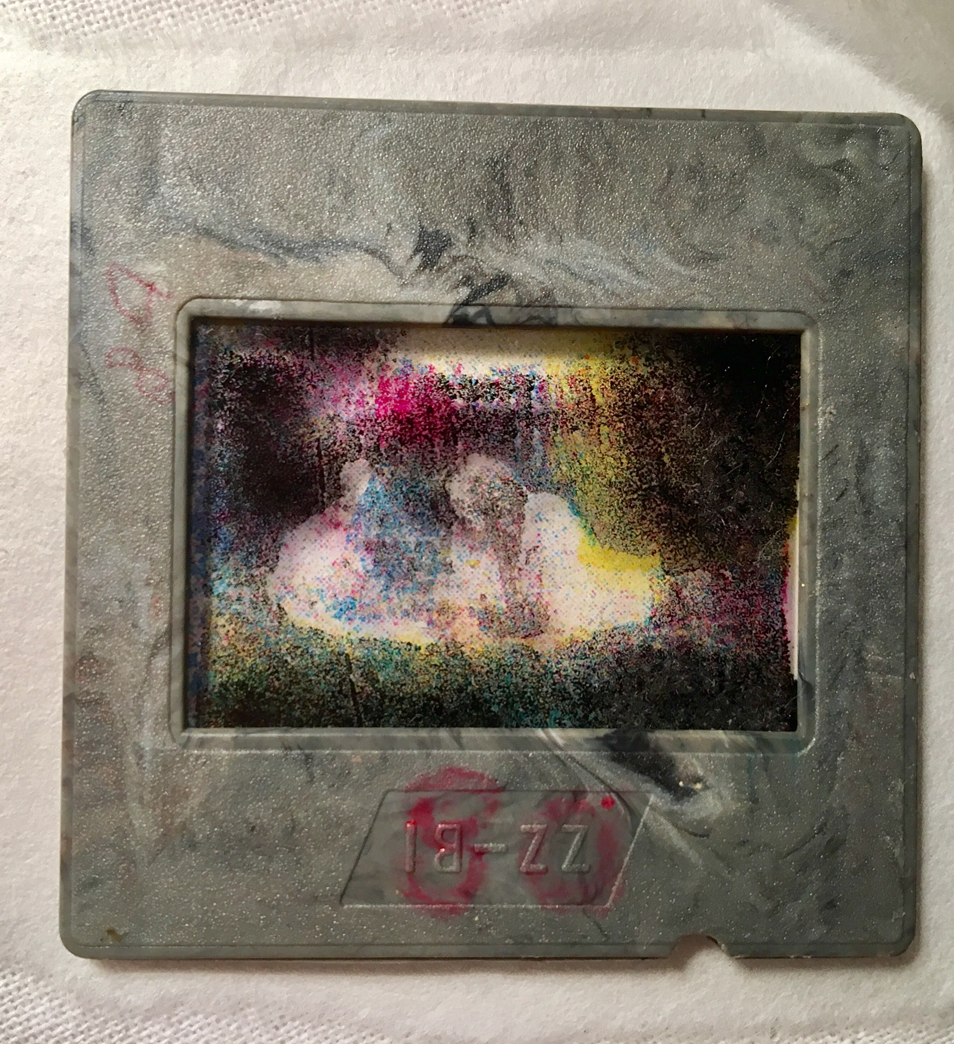
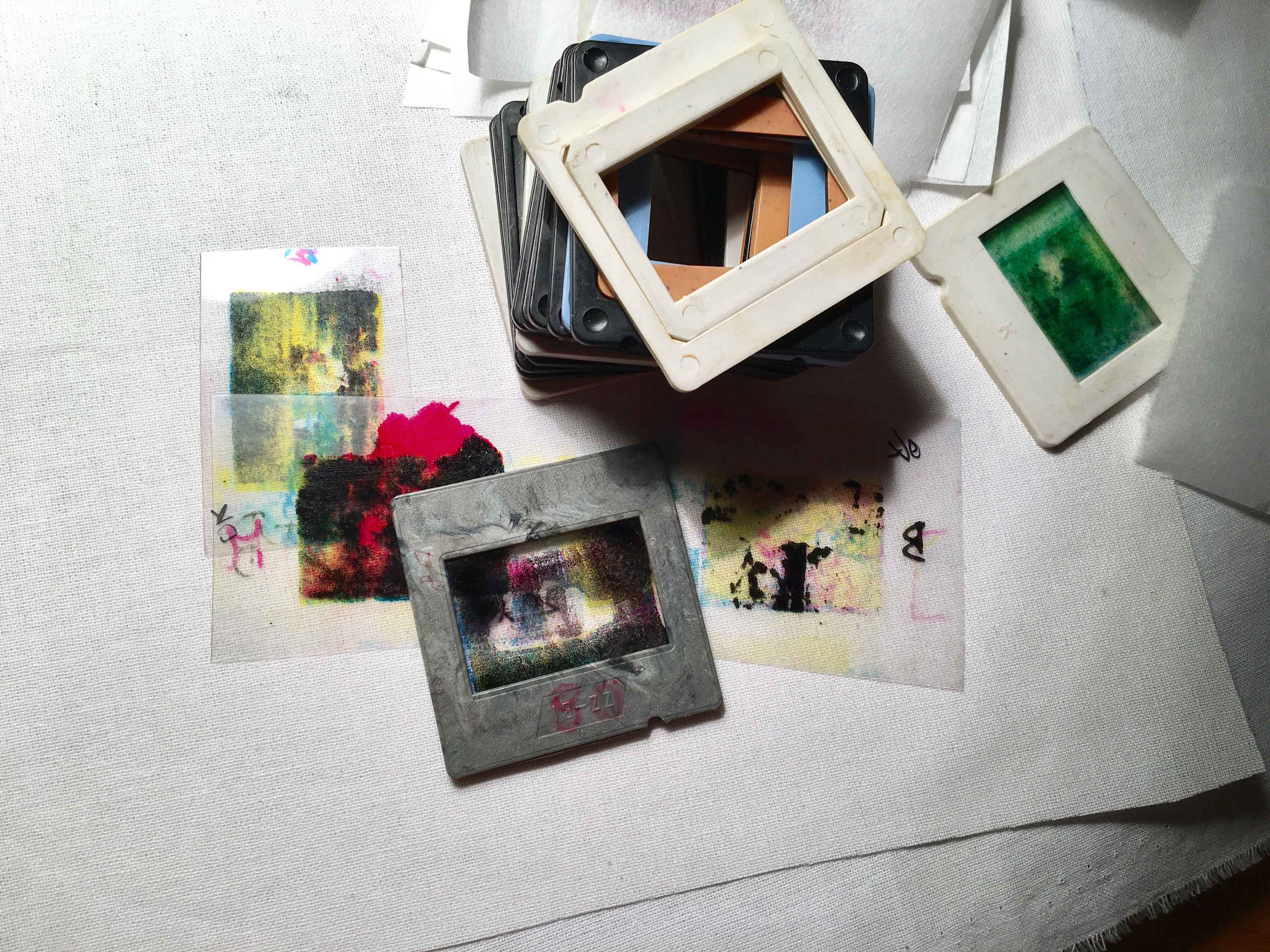
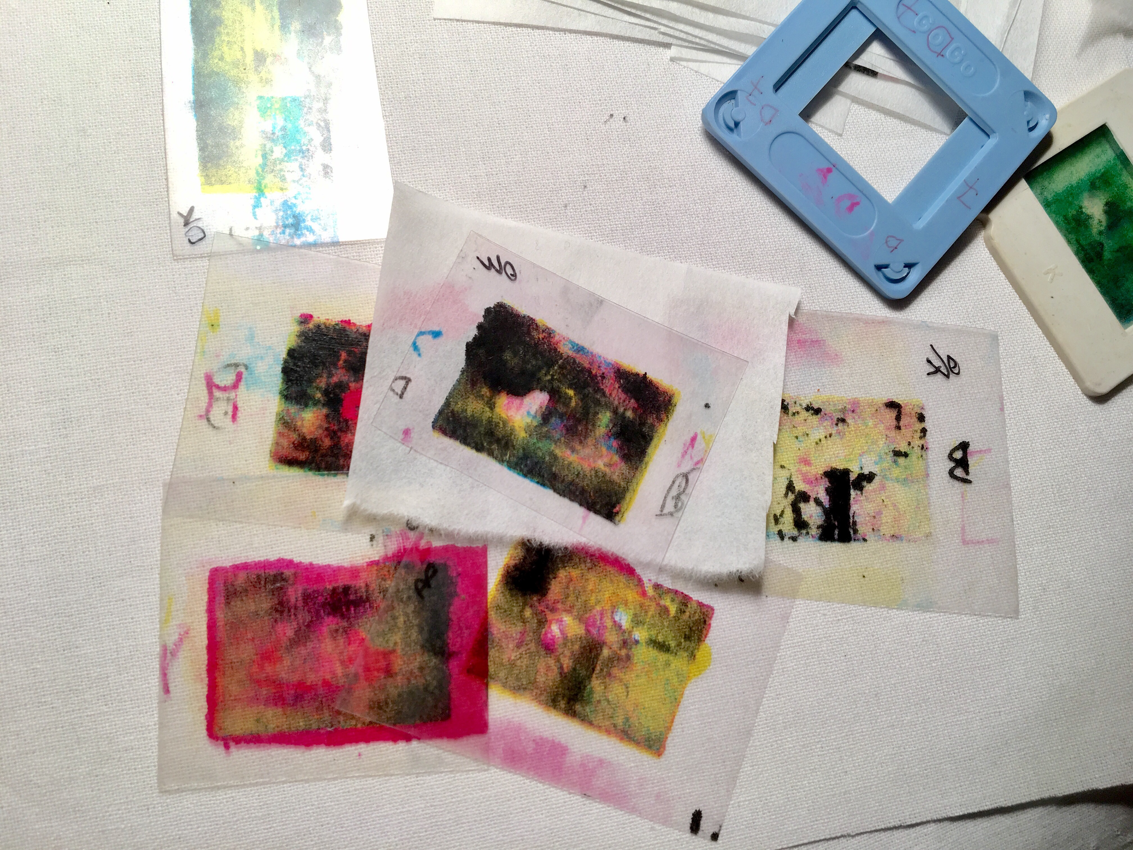
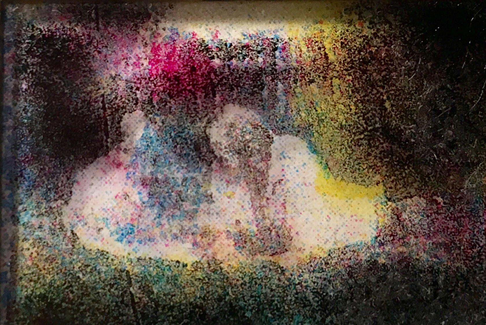
In 2018, after years of printing on fabric, I created a series of works on transparent film. These were miniature lithographs (2.5 × 3.5 cm), functioning simultaneously as slides for an analog projector. Each film was printed four times using CMYK color separation (cyan, magenta, yellow, and black).
The works are based on slides from my childhood, taken by my parents. Scanned and digitally processed, they were gradually transformed into their lithographic equivalents. I began printing with the lightest color—yellow. Depending on tone, it appeared more or less saturated on the stone. Experimenting with pressure, I observed how color either formed discrete points or merged into patches. Unlike paper or fabric, film does not immediately absorb ink; each layer must dry before the next is applied.
As the layers accumulated, familiar images became transformed. Warm colors replaced cold ones, and vice versa. Although the scenes remained recognizable, the chromatic narrative no longer matched my memory of them.
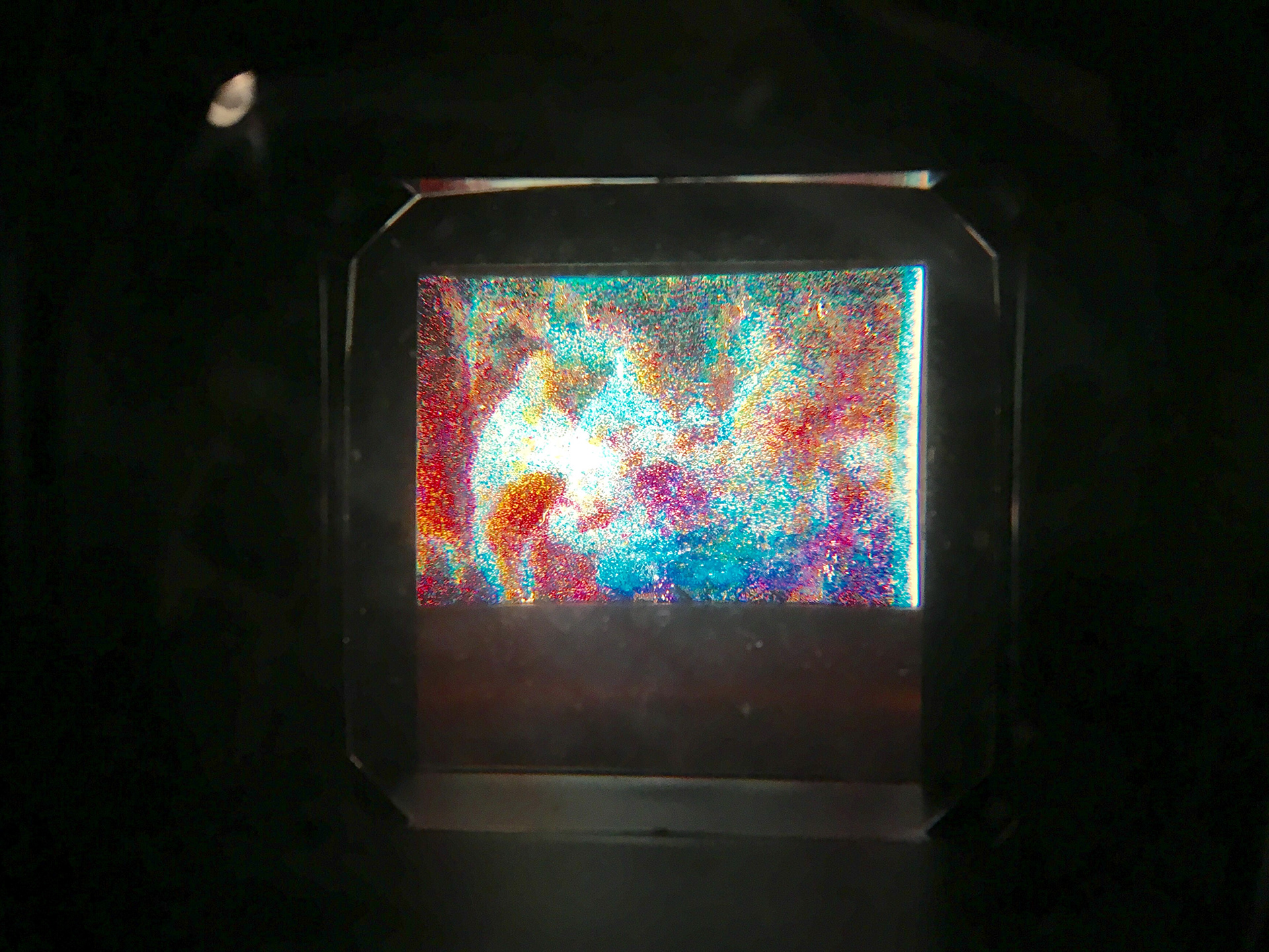
Cut-out miniatures inserted into slide frames became both lithographs—to be held—and diapositives—to be projected. Enlarged through a projector, the characteristic lithographic grain disrupts recognition: viewers perceive photographic logic, yet the image structure is entirely different. Only after a moment do figures and objects emerge from the dense field of color.
The project can be seen as a subtle, ironic reference to European painting tradition. Impressionism liberated color from the obligation of describing fixed properties of objects. Later, Neo-Impressionists such as Georges Seurat and Paul Signac attempted to construct a more “scientific” form of optical realism through systematic application of pure color dots.
My lithographs on film can be understood as a kind of neo-neo-impressionism—a “corrected divisionism” in which objects disappear and color regains its autonomous, almost fairy-tale existence. The mechanical discipline of point application is replaced by the material logic of photographic and lithographic processes.
By de-realizing childhood photographs, I aimed to give them a universal dimension. The images no longer function as personal souvenirs; they become shared memory—experienced by every viewer in the gallery space. The act of projection, accompanied by the sound of slide changes, becomes a nostalgic ritual in which meaning dissolves into light, color, and emotion.
Ultimately, the dominance of light shifts the balance—towards joy.